AI Summarise
Select your AI for quick analysis of the article:
A Guide to Kitchen Colour Schemes for 2026
Summary: 2026 kitchen colour schemes at a glance
- Earthy neutrals, muted greens, soft blues, warm timbers, and richer colour accents lead 2026 kitchen palettes.
- New releases like Polytec Boston Oak give homeowners fresh ways to introduce warmth and realism to cabinetry design.
- Choose colours based on lighting, home architecture, undertones, flow, and the mood you want your kitchen to evoke.
- 2026 design highlights: two-tone cabinetry, contrasting islands, colour blocking, bold splashbacks, warm metallics, vertical textural detailing, and curated décor.
- Colour schemes vary by style — coastal, minimalist, Japandi, modern shaker, mid-century modern, and more.
- The Maker Designer Kitchens’ interior designers help you refine your colour palette and every finish so your kitchen feels elevated, cohesive, and uniquely yours.
A fresh approach to kitchen colour schemes in 2026
Kitchen colour design has evolved significantly in the last few years. As Perth homeowners search for more personalised, calming, and contemporary spaces, the trend has moved away from stark whites and into richer, warmer, and more layered palettes.
At The Maker Designer Kitchens, we’re seeing a strong shift toward natural hues, soft colour expression, warm timbers, and premium textures — all designed to elevate the kitchen into a statement zone that still feels deeply connected to the home.
Our designers see thousands of material combinations every year, giving us a unique lens into what’s shaping the next wave of colour design locally in WA.
This guide shares the leading kitchen colour schemes for 2026, how to choose the right palette for your home, and the combinations we recommend for a refined, long-lasting design.
2026 kitchen colour trends shaping Perth homes
From natural timbers to muted greens, the 2026 kitchen colour trends reshaping Perth homes reflect a growing desire for warmth and character.
1. Earthy neutrals and soft warm whites
Warm, grounded tones continue to dominate kitchens in WA. Think:
- Oatmeal and mushroom greys
- Warm white rather than crisp white
- Taupe-based neutrals
- Soft beiges and pared-back stone hues
These earthy tones offer longevity and pair beautifully with engineered stone, timber flooring, and textured splashbacks.
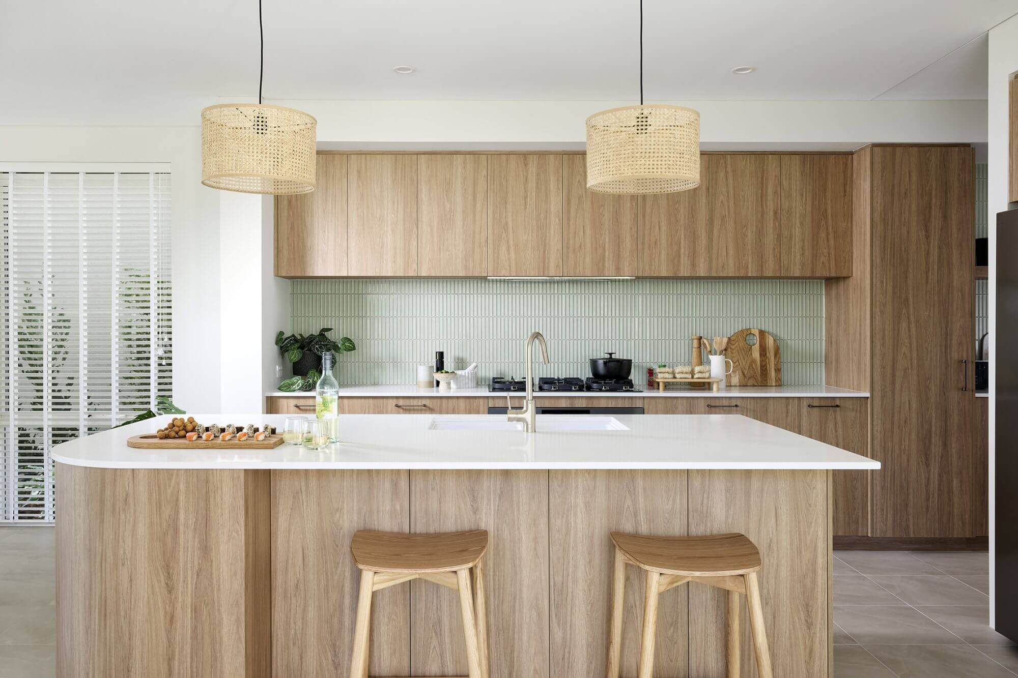
2. Muted greens and organic blues
Inspired by nature, muted colour is surging — especially in homes seeking calm and sophistication.
From Polytec Topiary and Verdelho to mid-tone blue-greens, these palettes pair effortlessly with brushed brass, soft grey stone, and warm timber.
Green and blue cabinetry is now considered a timeless colour choice when applied thoughtfully.
Perfect for: Coastal, modern shaker, mid-century modern, and Japandi kitchen styles.
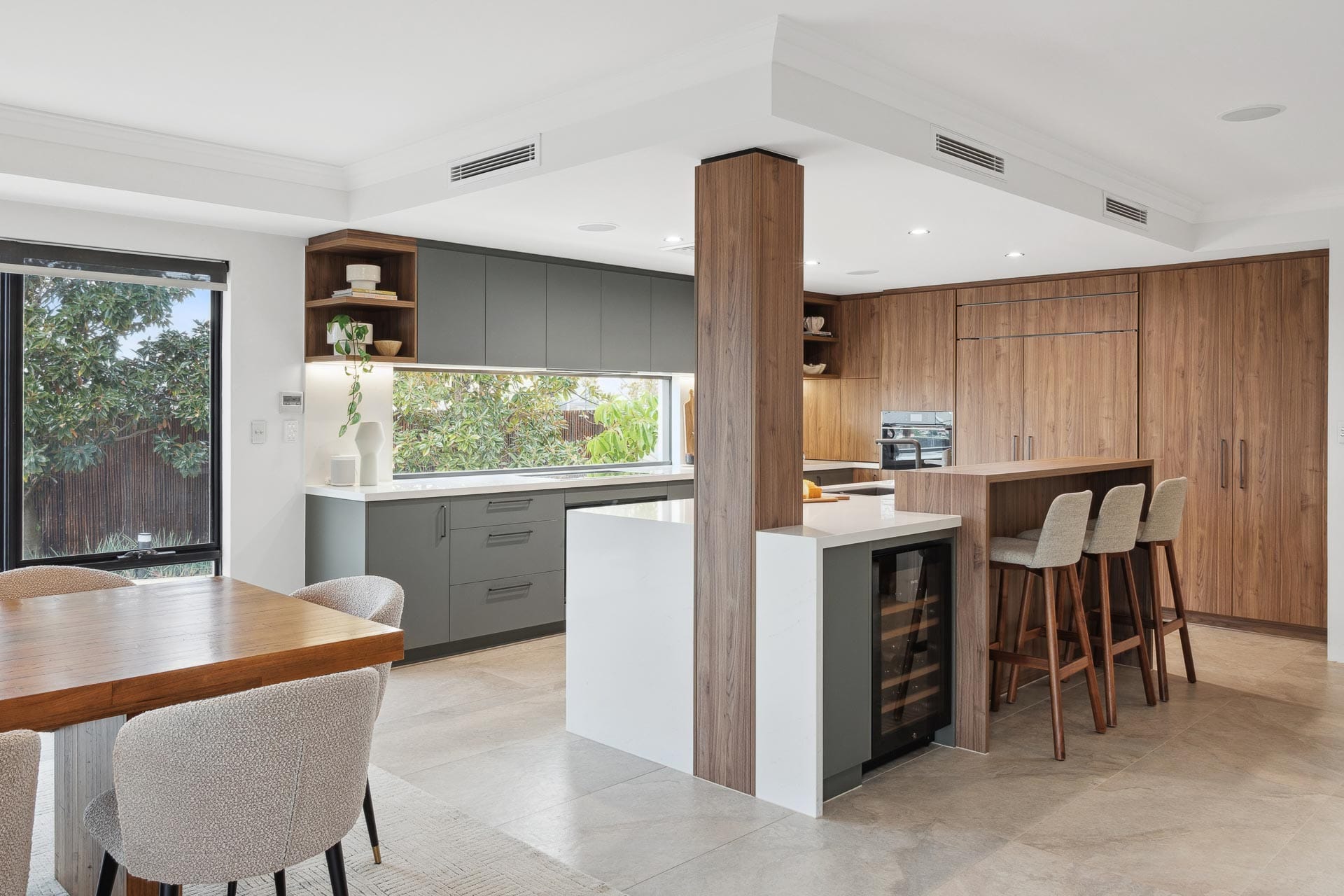
3. Warm timbers and the rise of Boston Oak
Timber is more than a feature, it’s becoming an essential design element in 2026 kitchens. The newest standout is the Polytec Boston Oak Collection, bringing a highly realistic, contemporary woodgrain that’s warm without being rustic.
Boston Oak works beautifully for:
- Island accents
- Overhead cabinetry
- Feature shelving
- Two-tone pairings
- Integrated appliance panels
It elevates both light and dark kitchen palettes, adding depth and natural warmth.
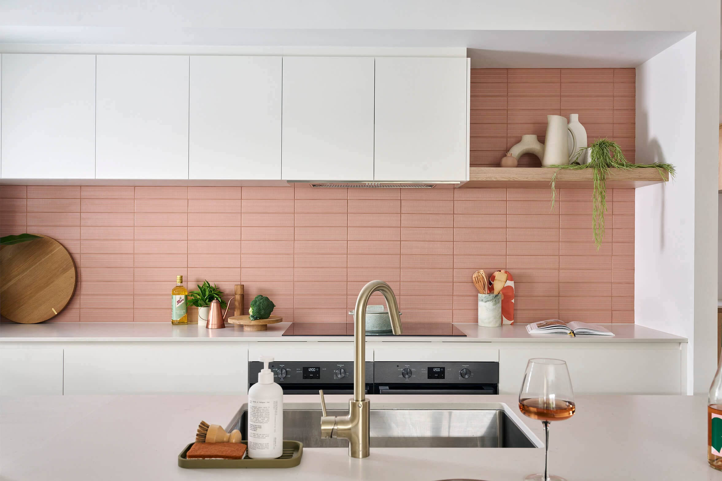
4. Rich colour accents & deeper hues
While soft palettes remain dominant, we’re also seeing the introduction of colour accents such as:
- Deep navys
- Charcoals
- Rich walnut tones
- Muted terracotta
- Chocolate browns
These shades create mood and drama, especially when contrasted with warm metallics or stone veining. They pair particularly well with open-plan homes that receive generous natural light.

How to choose a kitchen colour scheme that truly suits your home
Choosing your colour palette is equal parts design knowledge, intuition and personal preference.
Our designers help you refine colours using these four key areas:
1. Understand your home’s style and architecture
Your colour scheme should complement the style of your home, not compete with it.
If your home leans coastal
Opt for whitewashed timbers, breezy blues, and muted greens.
If your home is contemporary
Try a tonal palette: warm whites, subtle greys, black accents, and refined timbers.
If your home is character-filled or mid-century
Walnut tones, olive greens, and saturated colour work beautifully.
If your home is minimalist
Stick to monochromatic schemes, soft neutrals and clean-lined materials.
2. Assess lighting — natural and artificial
Light dramatically influences colour. Considering both the natural and artificial light in your home will help enhance the tones you choose. We also recommend taking material selections home to view them in your own lighting conditions.
North-facing kitchens
In Perth, north-facing kitchens receive strong, consistent sunlight for most of the day, which can naturally warm up the space.
This allows you to confidently use cooler neutrals, soft greys, muted blues, or even deeper, more saturated hues without the room feeling heavy.
The abundant northern light balances these tones beautifully, helping maintain a calm, refined atmosphere even with darker cabinetry or bold feature colours.
South-facing kitchens
South-facing kitchens in Perth tend to receive softer, cooler natural light, especially during winter when daylight hours are shorter. To counteract this cooler light quality, warm whites, creamy neutrals, earthy undertones, and rich timbers work exceptionally well.
These warmer palettes introduce depth and comfort, creating a welcoming feel even on overcast days. Timber accents, from Boston Oak to deeper walnut, are particularly effective in adding natural warmth to south-facing spaces.
Artificial lighting considerations
Perth homes often rely on artificial lighting in the early morning and evening, when natural light is low. Choosing warm LED temperatures (2700k–3000k) helps bring out the richness of warm palettes, enhancing the creamy undertones in cabinetry and highlighting the natural veining in stone benchtops.
This lighting range creates an inviting glow that complements earthy neutrals, warm timbers, and mid-tone colour schemes, ensuring your kitchen feels consistent and cohesive at any time of day.
3. Consider undertones
Your benchtop, splashback, and cabinetry must share a harmonious undertone.
Examples being:
- Warm white cabinetry + cream-based stone
- Taupe stone + Boston Oak timber
- Muted green cabinetry + warm grey veining
- Charcoal cabinetry + timber overheads
Our designers work closely with clients to compare every swatch, stone sample, and timber finish. This step ensures no unexpected undertone clash, which is a common issue in DIY renovations.
4. Define the mood you want to create
Colour shapes emotion, and in interior design it plays a powerful role in defining how a space feels and functions.
- Light neutrals = calm, spacious, timeless
- Muted greens/blues = restorative, organic, coastal
- Warm timbers = grounding, welcoming
- Deep tones = atmospheric, bold, luxurious
Think about how you want to feel when you walk into your kitchen, as this will greatly inform your colour palette choices for your kitchen renovation.
Where to apply colour in your kitchen design in 2026
Colour isn’t only about cabinetry. In 2026, homeowners are layering colour across multiple surfaces to create a richer, more architectural result.
Cabinetry
Cabinetry remains the most influential colour decision.
2026 favourites:
- Warm white or soft grey base cabinetry
- Boston Oak, Prime Oak, or Florentine Walnut accents
- Muted greens and blues
- Two-tone mixes
- Modern Shaker profiles for depth
Benchtops
Benchtop material and colour selection plays a major role in defining the palette.
2026 trends include:
- Warm-veined marble look stones
- Soft greys instead of crisp white
- Dramatic veining for feature islands
- Subtle, organic textures and shapes
Splashbacks
Kitchen splashbacks are a playful way to introduce colour to your kitchen design. You can consider:
- Vertical kitkat tiles in greens/blues
- Stone slab splashbacks for a seamless look
- Breezy coastal tiles in soft tones
- Fluted glass for transparency and texture
Kitchen island
The kitchen island is a great opportunity for a major colour moment. Think about:
- Contrasting island colour
- Boston Oak island with stone fascia
- Curved islands with STECCAWOOD battens
- Bold colour-blocked island
Read more here: Tips to design your kitchen island
Hardware & tapware
Warm metallics continue to dominate in 2026. Think:
- Brushed brass
- Brushed nickel
- Gunmetal
- Champagne finishes
These tones sit beautifully with soft greens, warm whites, and engineered stone finishes.
Lighting & décor
Colour can be expressed subtly through:
- Pendant lights in warm tones
- Bar stools in timber or woven textures
- Décor in terracotta, soft blues, brushed golds
These accessories are easy to refresh, offering longevity when paired with timeless cabinetry.
Colour schemes by kitchen style
Every kitchen style carries its own design language, and your colour scheme plays a major role in bringing that style to life.
Minimalist kitchens
- Palette: warm whites, soft greys, charcoal accents
- Materials: smooth matt finishes, stone splashbacks
- Tip: keep two-tone subtle for a clean effect.
Coastal kitchens
- Palette: bleached timbers, seafoam greens, soft blues, warm whites
- Materials: fluted glass, light stone, Boston Oak
- Tip: choose warm whites instead of cool whites to avoid stark contrast.
Luxury kitchens
- Palette: deep tones, soft neutrals, rich walnut, black accents
- Materials: dramatic stone veining, metallic hardware
- Tip: add vertical detailing for depth.
Modern kitchens
- Palette: tonal neutrals, timber, muted colour
- Materials: mixed textures, handleless cabinetry
- Tip: use a contrasting island for visual structure.
Mid century modern
- Palette: walnut browns, mustard tones, olive greens, teal blues
- Materials: warm timbers, vertical grain, curved detailing, feature stone
- Tip: Incorporate statement colour or texture — such as Florentine Walnut or a retro-inspired tile — to reinforce the nostalgic yet refined character of this style.
Japandi
- Palette: soft neutrals, warm whites, muted greys, pale timber, gentle sage
- Materials: natural timber, smooth matt finishes, textured stone, subtle ribbed details
- Tip: Keep the palette restrained and nature-inspired; Boston Oak or light-toned timbers work beautifully to enhance the calm, minimalist aesthetic.
Balancing trends with timelessness
A future-proof colour palette isn’t about avoiding trends; it’s about grounding your design in natural materials, warm neutrals, subtle colour, and high-quality finishes.
Trend-driven elements can then be layered in through your island, splashback, lighting, hardware, or décor. Our kitchen designers help you strike the right balance so your kitchen feels contemporary today and effortlessly elegant for years to come.
How our designers help you refine your perfect palette
With hundreds of kitchens completed and with a qualified interior design team, The Maker Designer Kitchens specialises in guiding homeowners through the colour selection process with confidence.
In your design consultation, we help you:
- Compare stone, timber, and cabinetry samples
- Explore colour pairings under accurate lighting
- Consider your architectural style and lifestyle
- Build a cohesive palette across cabinetry, benchtops, splashbacks, and appliances
- Visualise selections through drawings and material combinations
Our Perth showroom showcases working kitchens, trending materials, and real-life colour schemes so you can see and feel every option before making a decision.
Your dream colour palette starts here
If you’re ready to explore the perfect kitchen colour scheme for your renovation, our interior designers can guide you through every option — from neutral whites to bold tones, warm timbers, and the latest 2026 material trends.
Visit our Perth showroom or book a design consultation to start designing a kitchen that feels beautifully cohesive, personal, and timeless.
FAQs: Kitchen colour schemes
What are the most popular kitchen colour schemes for 2026?
Warm neutrals, muted greens, soft blues, warm timbers, and rich accent colours are leading the way. These palettes balance modernity with timeless appeal.
Is coloured cabinetry still in style?
Absolutely. Muted greens and blues are now considered enduring choices, especially when paired with warm timbers and soft stone.
How do I choose a colour scheme that suits my home?
Consider your home’s architectural style, natural light, undertones, and the mood you want to create. A design consultation helps refine these decisions.
Do darker colours make a kitchen feel smaller?
Not necessarily. When balanced with warm lighting, timber, or lighter benchtops, deeper hues create a luxurious, intimate atmosphere.
How can I introduce colour without overpowering the space?
Try two-tone cabinetry, a contrasting island, coloured splashback tiles, or small décor elements that can be updated easily.